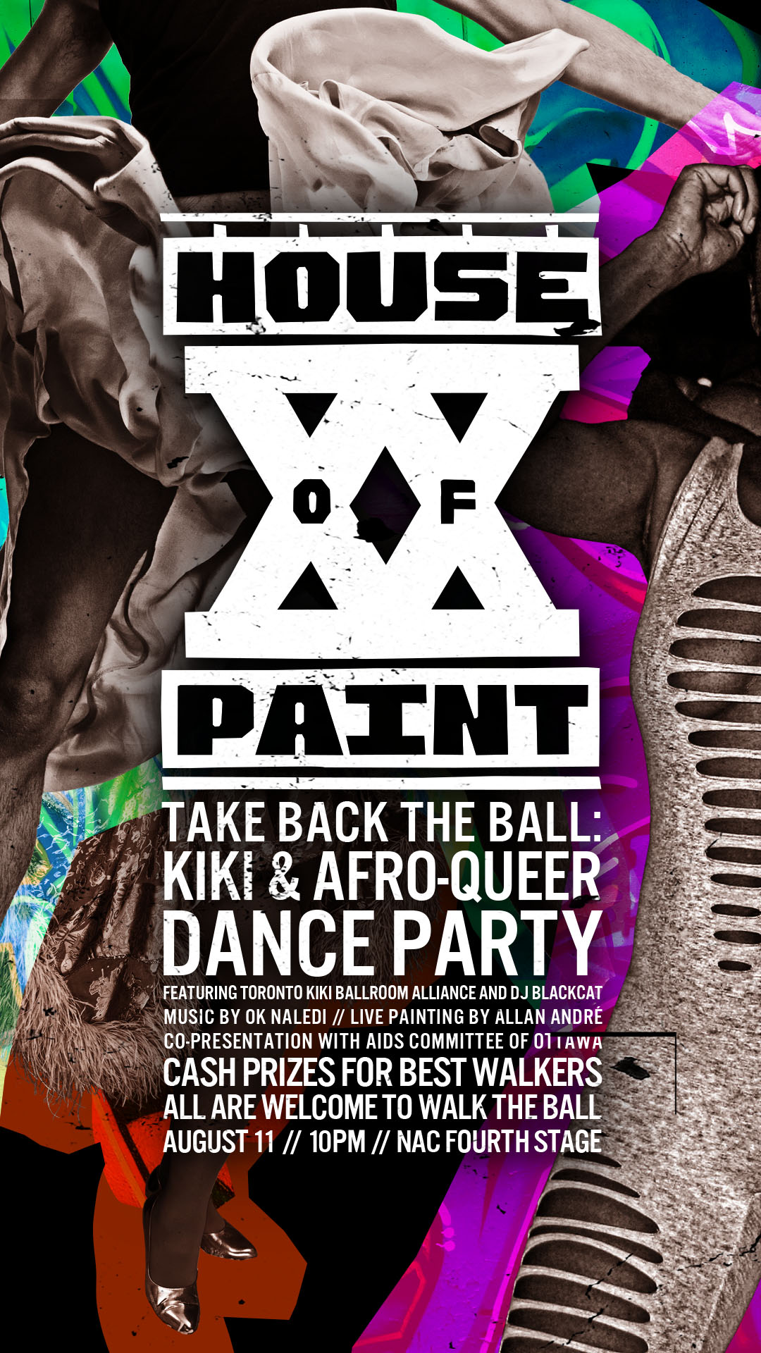
House of PainT XX
Promotional materials
House of PainT XX
Promotional materials
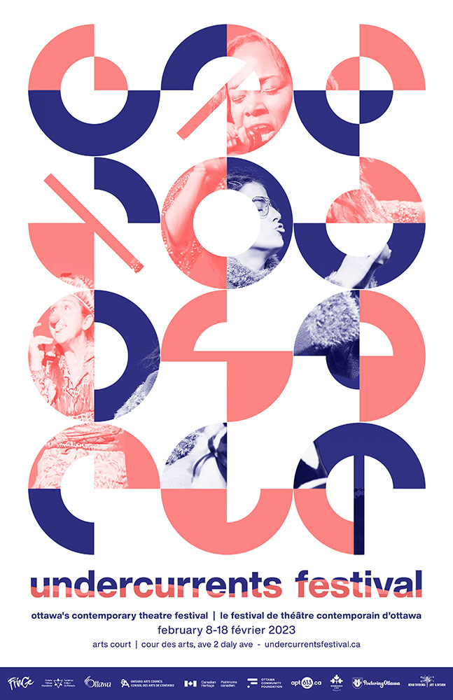
Undercurrents Festival
Posters and promotions
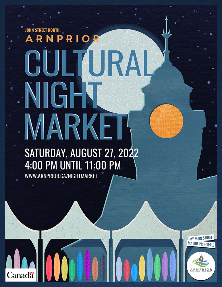
Arnprior Night Market
Poster
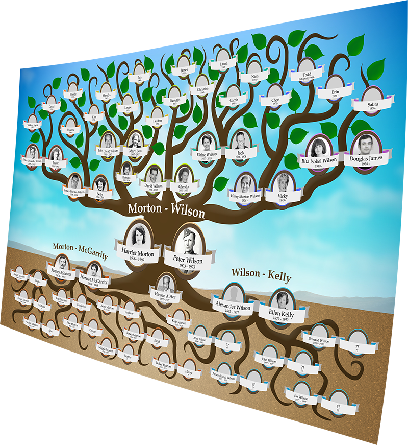
Wilson Family Tree
Family Tree

Huy
Tattoo design
KMDI
Visuals and promotions

Invest in Canada
Mural design

Bathgate Homestead
Poster

Ottawa Fringe Festival
Posters and promotions

Click Armor
Character design
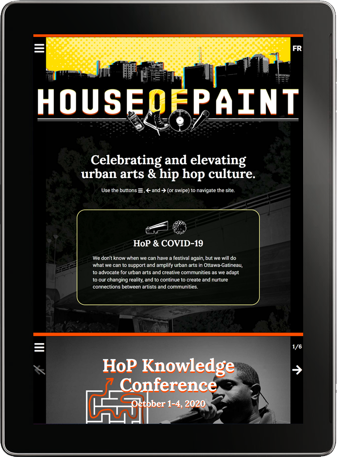
House of PainT 2020
Multi-purpose website
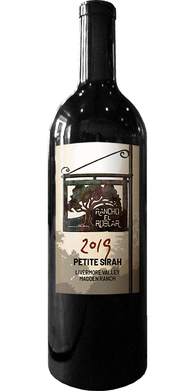
Rancho Roblar
Wine label

SShine Lab
Multi-Media Website
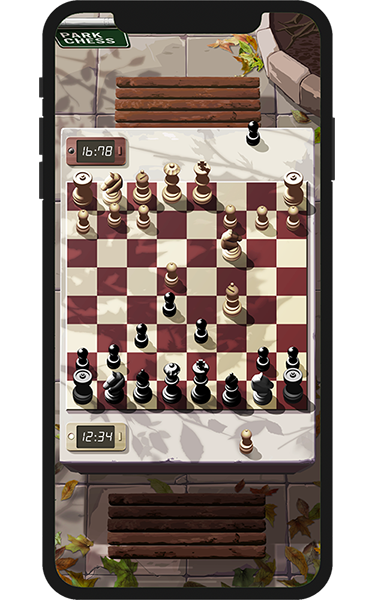
Park Chess
iPhone game

FoodReach (4.0)
Food procurement website
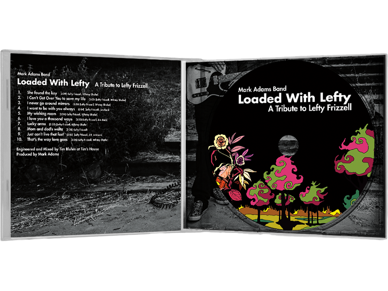
Loaded With Lefty
CD jewel case
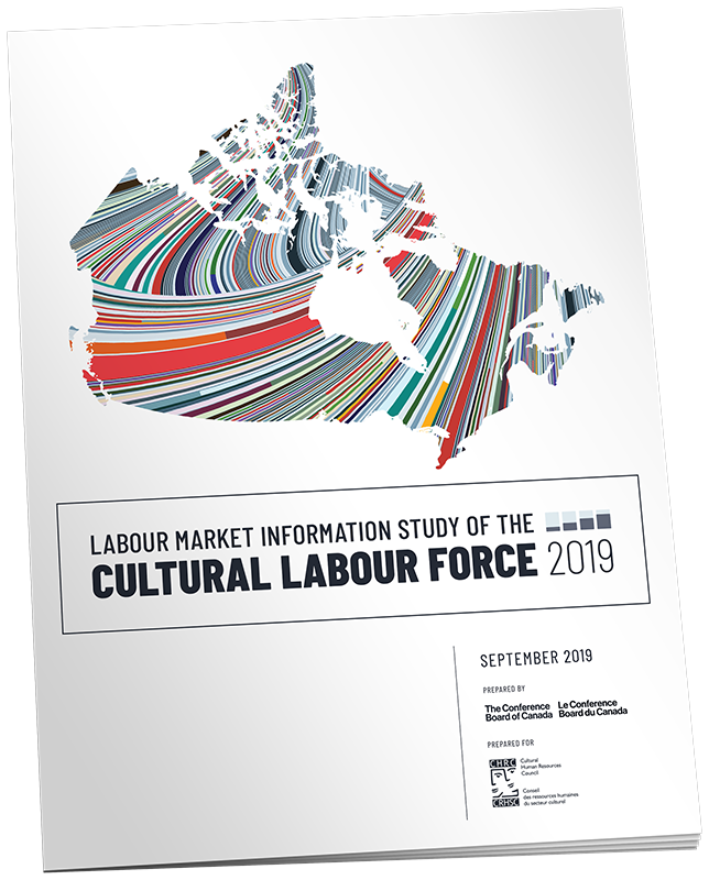
LMI Study 2019
Study booklet
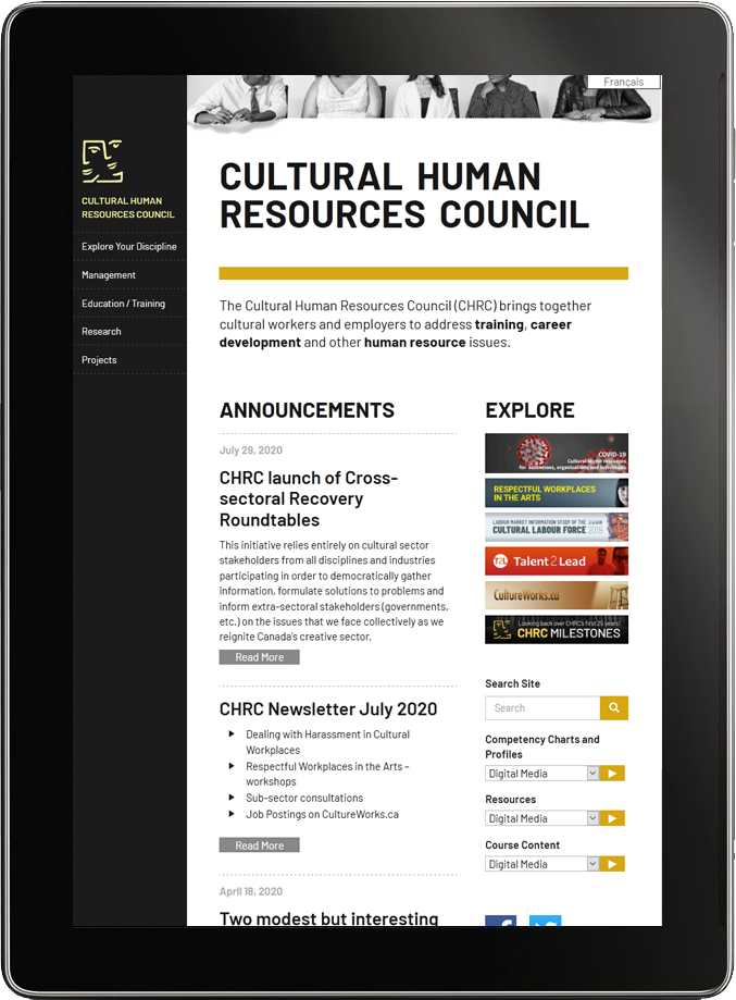
Cultural Human Resources Council
Website

Dharma Developments
Brochure and website
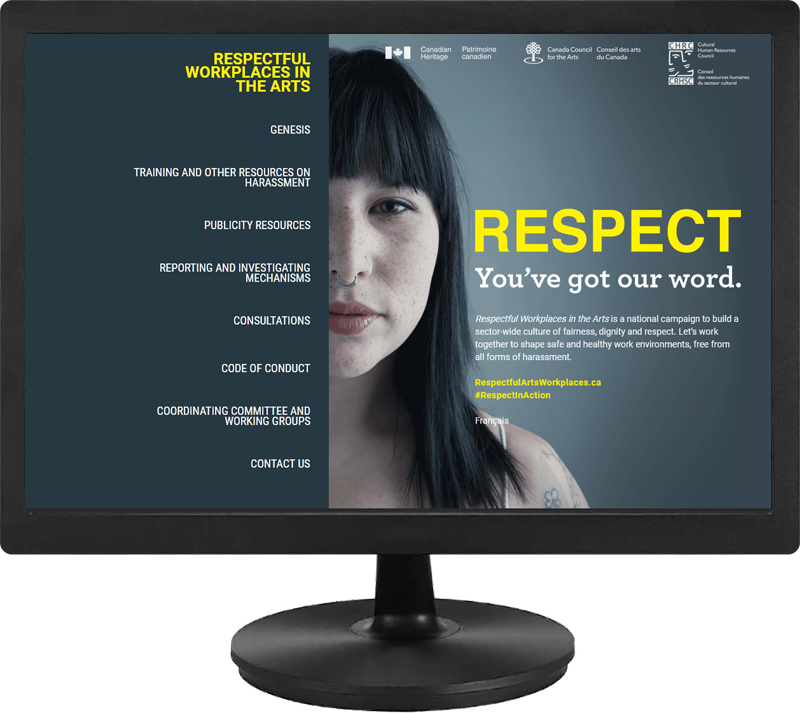
Respectful Workplaces in the Arts
Website